author
Diona Kidd
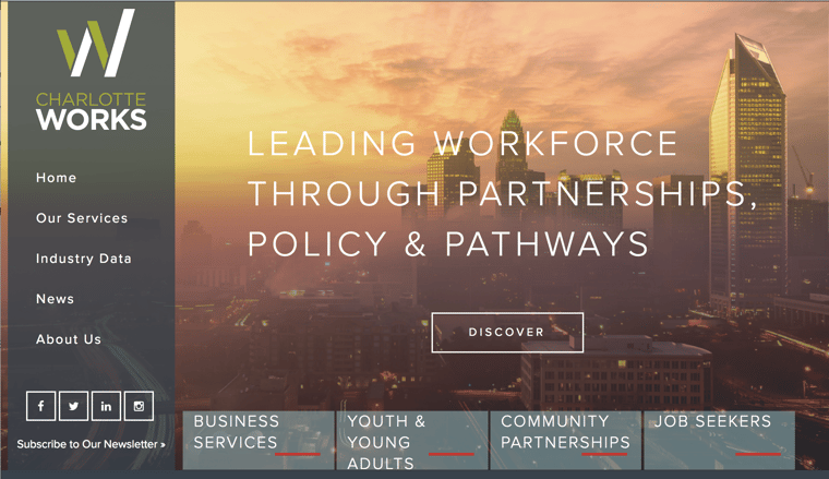
Charlotte Works is a nonprofit organization that serves as the workforce development board for the City of Charlotte and Mecklenburg County, N.C. We recently helped them redesign their website as they re-envisioned their role in the community.
There were rave reviews once the website was launched. It was attractive, innovative and useful for those who were just learning about Charlotte Works. It was such an awesome experience working with the Knowmad team! We continue to keep them in mind as a great partner for ongoing projects!
- Katrina, Charlotte Works Communications Manager
Challenges
In the past, Charlotte Works served primarily as a career center; however, today Charlotte Works is an organization that advances policy relating to the workforce system while providing guidance and oversight for workforce development programs. Staff needed the organization’s online presence to support its revised organizational role, new mission and various unique target audiences.
During our discovery meetings, we learned Charlotte Works faced a variety of different challenges with its current website. Here were four key areas that drove the website redesign:
1. Improving the User Experience - The overall user experience was not intuitive; the site wasn’t remotely mobile-friendly, either.
2. Filling the Content Gaps - The content didn’t accurately reflect the shift in Charlotte Works’ mission and vision, or support marketing efforts.
3. Streamlining Website Management - The existing site was difficult to manage because it consisted of two parts: marketing pages (the website) and a blog. Moreover, these areas were controlled by different parties, which made website management difficult and time-consuming.
4. Organizing Industry Data - Site visitors relied on the website for important industry data, but Charlotte Works, along with its partners, needed an easier and more organized way to complete monthly reports.
As the communications manager, I had a really good idea of the type of partner we needed to help with our website redesign.After meeting with the Knowmad team, I was excited that they understood how important it was for us all to be on the same page.
- Katrina, Charlotte Works Communications Manager
Concept & Planning
The first step was one of the most important ones: a client-facilitated brainstorming session with the entire Charlotte Works team, with teammates from each respective department, allowed us to understand the different roles within the organization, and how that needed to translate to the revamped website experience. This forced Charlotte Works to hone in on their overall messaging, setting the stage for the new website’s look and feel.
During this time, the idea of Charlotte Works as a workforce aligner and convener was stressed as a key message, which also led to the use of bridge imagery to reinforce this important idea. We later replaced this with an image of Charlotte but it was helpful imagery for the project.
Once the look and feel took shape, we also spent time discussing how to improve overall site function.
Getting answers to these technical questions allowed us to make significant functional changes. For example, for years Charlotte Works’ CARE3 partners had been emailing or faxing their reports; now we knew they needed their own portal so they could simply upload those reports.
Capturing the Voice
As usual, keyword research was completed so it could be incorporated into the content and the webpages. Then, once the tagline, mission and vision statements were set, we moved into content development. While Charlotte Works wanted to keep its professional voice, the staff also wanted to move toward more accessible language.
Overall, they wanted to tip the scales toward having a friendlier (“more inviting”) tone—but without being too casual since their audience consists of a wide-ranging group of workforce, economic development, educational, and industry partners. An initial content draft was submitted, and after digesting feedback from different subject matter experts within the organization, the voice was set, and utilized cohesively throughout the site.
Design & Development
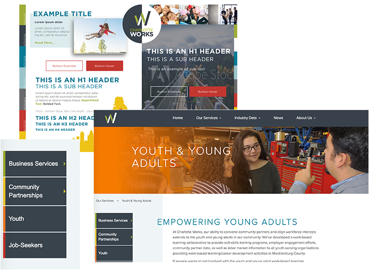
The use of Styles Tiles was beneficial to the design process. It allowed us to determine what would work best for the font, the headers, and the colors—and where the different colors would be used (each department was assigned its own color). Throughout the site there is an “overlapping” effect, and this idea came about early in the process, as it was first introduced in the Style Tiles.

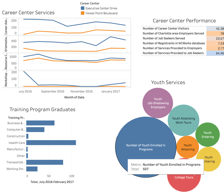
Tableau, a business intelligence and data visualization software, was integrated to address the need to display market data in an easy-to-use format.

Prototyping Interactive Elements
Prototyping is always helpful since it can save time, especially on projects with tight timelines like this one. We prototyped two elements for the Charlotte Works website.
Prototype #1:
The slide-up panel element on the homepage; we wanted to ensure that it performed in a way that was easy-to-use. We showed it to key decision-makers before we actually proceeded with the idea. This was helpful to the client since they could see how it would work—and it prevented any surprise changes later on.
Prototype #2:
Prototyping a custom animation led to us scrapping the idea before it made it to production. Making the decision early on saved time and effort.
UX / Navigation
With the user experience being one of the major challenges for the project, a lot of energy was invested in the navigation. On the redesigned site, the navigation is larger when the user is at the top of the page; now, with a quick glance, the user can find a specific page with ease. Then, as the user scrolls down the page, the navigation becomes smaller. Because the user is focused on this page, more screen real estate is given to what the user is actually looking for.
Hiding unnecessary elements on certain pages had an important result: it prioritized content based on user needs. Visitors are able to find what they are looking for with ease—and when they do, they are funneled to the information most important to them with minimal distraction.
Mobile Experience & Responsive Design
 Responsive website design is included with all of our website projects. With 40% of Charlotte Works’ traffic coming via mobile, we needed to ensure that the user experience translated to tablets and smartphones, too. While the site uses a lot of overlapping sections as part of its unique style, orchestrating how these sections look and react at different screen sizes created some challenges. This was overcome with thoughtful testing and debugging.
User Testing
As mentioned previously, streamlining the mobile experience presented some challenges. The user testing definitely uncovered some bugs here, and on the desktop version of the site, too. It really upped the quality of the site before launch by allowing us to correct some of the biggest user annoyances.
Outcomes

Ultimately, all of the challenges we started with were addressed:
- Management of the website was simplified
- Messaging aligned with the mission and vision
- Budget and timeline were delivered as promised
- Monthly reporting process was streamlined
- Usability and engagement improved
In addition, Charlotte Works gained over 30 new positions in search as a result of our built-in SEO optimization processes. And, we received a 2017 Platinum Marcom Award for Nonprofit Website Design.
We're looking forward to working with them on future projects! Great clients and relationships like Charlotte Works are what gets us excited.
Talk to us about your project!
.webp?width=900&height=548&name=wyatt-mobile%20copy%20(2).webp)

